Adelphi has been localising printed materials for over 20 years here is some advice on the do’s and don’ts when making the English version.
Often, we find that designers are not aware that their work will be localised further down the line, and even if they do, do not necessarily know how to adapt their work to make the process easier later on. Below are some examples of the most frequent mistakes we encounter. Avoiding these can save you a lot of money and can ensure that your work is completed in the quickest possible fashion with the minimum of fuss.
Some designs simply fill the page with text, leaving no room for text expansion. Most languages (with some notable exceptions) run longer than English and some of them run much longer. This causes the localised versions to have to make some sort of compromise: either text becomes smaller or a condensed font is used, or some material is completely cut out for brevity. Neither scenario is ideal, so it is much better to consider this aspect of the task at the design stage.
Overuse of text formatting features like coloured text, bold text and italic text etc. can slow down the localisation process, as the formatting needs to be applied to the precise word or phrase in translation that is equivalent to the English. Sometimes, this does not work at all if the target language has a dramatically different word order.
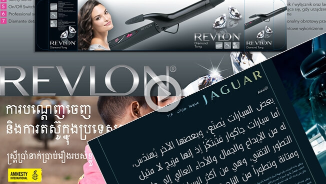
Embedded, non-editable text in images require extra attention or can be impossible to edit, and can slow things down dramatically, especially when over the main part of the image. Where possible, the text should be made available for editing in InDesign. If not, we will require all of the PSD files to work with.
Avoid designing paragraphs or “word clouds” with mixed font sizes that look good in English but have no chance of being replicated in the target language: quite often they do not have the same impact when localised and can often be “lost in translation”. Furthermore, due to word order difference, key words in English at the beginning of a sentence might end up in the middle or at the end of the sentence when translated.
One of the most frequent issues we encounter is incorrect and inconsistent usage of style sheets, in particular where one style has been used but in some instances bold text, italics or even different fonts have been changed manually. This can cause the most significant delays of all, and is the biggest source of small typos we encounter during internal QA.
Sending the artwork to be typeset BEFORE it is signed off by the client is never a good idea, and neither are new design changes after we have already started the work. We can do nothing in situations like these where significant changes are requested mid-project but start again and present new figures for the work, delaying work and incurring further costs for the client.
Localisation from English to right to left languages
These include languages such as Arabic, Urdu, Hebrew, Dari, Farsi, Kurdish and Pashto.
Right-to-left languages require that the documents have their alignment flipped. This takes longer the more complicated the design. We recently had an English design that the designer went to town with angles, images with 45 degree angled sides, text boxes with 45 degree angles. It was obvious they had no idea that it was to be localised into Arabic because when flipped all the angles were reversed, that’s ok if the image is large enough to accommodate this but in 90% of cases this does not happen. Therefore it took us twice as long to set this document as normal costing the client twice as much.
Right to left languages also do not have uppercase, this is a problem we often come across as the English has uppercase sentences or uppercase words for effect. With Vidal Sassoon we agreed that where the English had uppercase we would substitute a bold font. Not quite the same but it gave emphasis where required.
Traditional (Cantonese) and Simplified (Mandarin) Chinese
Both Mandarin and Cantonese refer to spoken languages whereas Traditional and Simplified donates the writing systems. Mandarin is the official language in mainland China and Cantonese is used in Hong Kong, Macau and the province Guangdong.
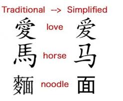
Chinese is one of the few languages which takes up less space when translated from English. Both Traditional Chinese (Cantonese) and Simplified Chinese (Mandarin) DTP therefore requires an understanding of the layout of Chinese and the ability to modify the design of the document to avoid large spaces and unsightly gaps in the translated Chinese document.
Chinese fonts
Legally to print your materials for use in the PRC you must be using fonts that are licensed for use in the PRC, otherwise you will be breaking the licensing agreement of the font manufacture. Adelphi has over 100 fully licensed fonts for use in the PRC. To see a list of our Chinese fonts please click here
Font problems
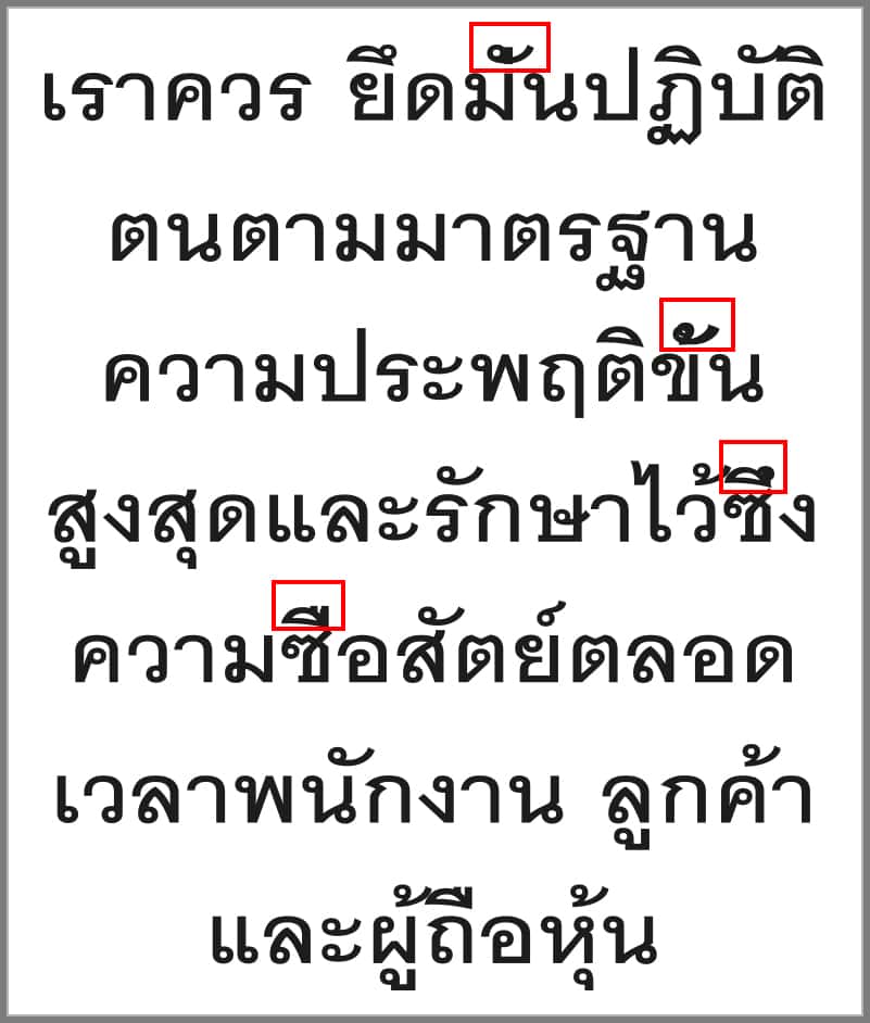
It is very important that the diacritics are correctly lined up otherwise the word meaning can change. The correct font must be used to display the diacritics in the right position.
| Correct Thai | Incorrect Thai |
 |
 |
Care has to be taken with some Hindi fonts, as occasionally they are not all mapped to the same keyboard layout, this means that some Hindi fonts cannot be swapped with another Hindi font, as some characters will corrupt. This means that the translator must use a standard professional font that can be used in the typesetting application, also some Hindi fonts do not have bold or italic options.
Line spacing in languages such as Burmese when the text has much taller characters than Latin text, because of this Burmese and other languages such as Cambodian, Hindi etc., often requires more vertical space between lines.

Text expansion can be a problem
For Instance in German typesetting text expansion can often be an issue. There are often very long compound words in German, which can create problems. This can produce untidy line-breaks when placed in narrow columns and so being able to hyphenate the text in the correct place is important.
Julian, unser Auszubildener,
kam zu uns während eines
Studienpraktikums,
so hat er es sehr schnell
begriffen.
In some German compound words, the first word serves to describe the second word in more precise detail, for instance die Zeitungsindustrie (the newspaper industry.)
They even have awards for the longest German word of the year! In 1999 the winner was: Rindfleischetikettierungsüberwachungsaufgabenübertragungsgesetz. The monster word consisted of 63 letters, 20 syllables, and ten individual words—all to express a law having to do with British beef (Rindfleisch) and the so-called “mad cow disease.”
Data required
We need the English original data for us to adapt it into a foreign language this is usually supplied by the design agency as a “collect or package” which includes all images, fonts and links (images) to the document. Without these we cannot create a print ready PDF as the deliverable.
To see typesetting samples go here